Project type
UX/UI design
Web design
Branding

Tools
Figma
Webflow

Timeline
3+ years
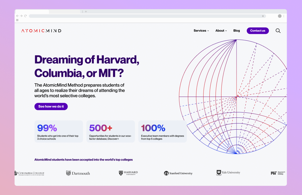
AtomicMind is an early-stage ed-tech company providing personalized tutoring and admissions support for students applying to top universities.
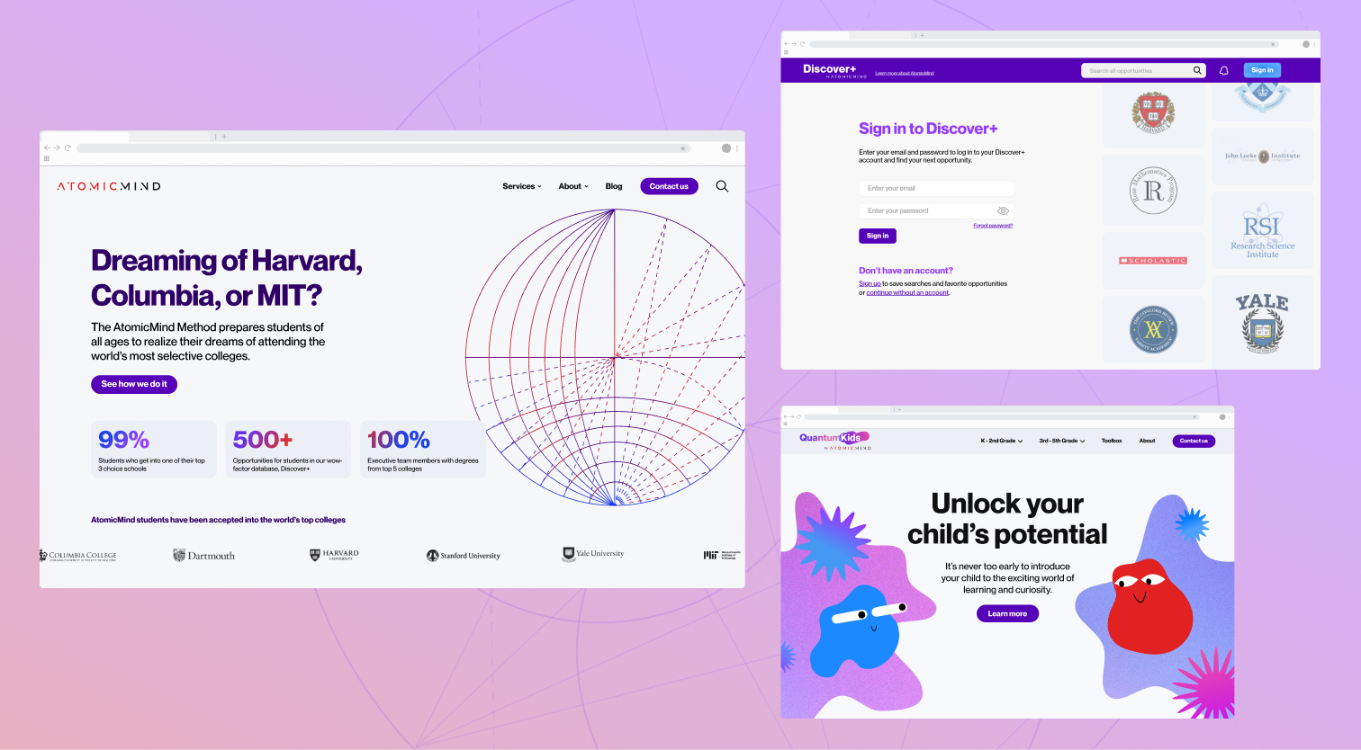
Over a 3-year engagement at Dialogue Theory, I worked across multiple initiatives spanning marketing, product, and platform design. As the company scaled, the challenge evolved from establishing a basic web presence to supporting a growing ecosystem of digital experiences, including a marketing site, a searchable opportunities platform (Discover+), and a new sub-brand for younger learners (QuantumKids).
My role focused on bringing structure and cohesion to this expansion by:
This work transformed AtomicMind from a single marketing site into a connected digital ecosystem.
When I joined, AtomicMind’s web presence consisted of a single landing page with limited hierarchy and no clear storytelling structure.
The initial goal was to expand this into a multi-page marketing experience that could communicate the depth of their offering with a very specific target audience: parents of high-performing students.
This required translating a highly personalized, human-centered service into a clear and scalable digital experience while evolving the brand and online presence to feel cohesive and aligned with the company's ambitions.
Parents of high school students (decision-makers)
High school students (15–17)
Working closely with the founders and a design lead, I began by reviewing early explorations and aligning on a direction that felt both sophisticated and credible.
From there, I developed the foundational structure of the site:
At this stage, design decisions were less about visual expression and more about clarity and structure. The goal was to create a system that could grow alongside the business.

The redesigned site provided AtomicMind with a stronger digital presence and supported early growth through improved storytelling and clearer navigation.More importantly, it established the foundation for the system that would later extend across multiple products.
As AtomicMind looked to expand its reach, they introduced Discover+, a searchable database of extracurricular programs, internships, and summer opportunities. The problem was how to structure and navigate a large, evolving dataset in a way that supports decision-making for our target audience.
Students and families are often overwhelmed by the number of available opportunities and the complexity of comparing them.
Each opportunity varies across multiple dimensions:
Existing solutions tend to present this information in static or fragmented ways, forcing users to manually compare options across different sources.
The opportunity was to create a system that simplifies this process by making the data structured, searchable, and comparable within a single experience.
High school students (15–17)
Parents
The first challenge was structural. Working closely with the team, I helped define how the data should be organized within Airtable, ensuring that each opportunity could be consistently categorized and filtered.
This required:
From there, I translated this structure into an interaction model that supports a clear flow from exploration to decision.
The experience was organized into three layers:
Attention was given to edge cases to ensure the system remained reliable under all conditions. This included defining behaviors for scenarios such as no matching results, incomplete data, and varying levels of information across entries, as well as establishing clear display logic.
One of the key challenges was determining how users should interact with a large number of filters without becoming overwhelmed.
An early approach placed filters in a left-hand sidebar. While familiar, this quickly became problematic as the number of categories grew, requiring excessive scrolling and reducing visibility of results.
Shifting the filters to the top of the page allowed users to maintain context while refining their search. Prioritizing a small set of high-impact filters, while collapsing secondary options into an “advanced filters” panel, helped balance flexibility with simplicity.
Another key challenge was how to present dense information in a way that is easy to scan.
Rather than displaying all available attributes, each opportunity card focuses on the most relevant information, using clear hierarchy and consistent layout to support quick comparison.
Visual elements such as logos were introduced to break up text-heavy layouts and improve recognition, even though this required additional effort in sourcing and data management.
On the detail pages, the layout was intentionally kept simple to accommodate variability in the data. Some opportunities contain more information than others, and the system needed to handle these differences without breaking visual balance.
Prototyping played a critical role in validating not only the user experience, but also the technical feasibility of the system.
Working closely with a Webflow developer, I used prototypes to test:
This ensured that the final design was both usable and buildable within the constraints of the platform.
The experience was organized into three layers:
Attention was given to edge cases to ensure the system remained reliable under all conditions. This included defining behaviors for scenarios such as no matching results, incomplete data, and varying levels of information across entries, as well as establishing clear display logic.

Discover+ became a key part of AtomicMind’s growth strategy.
It allowed the company to reach a broader audience, particularly students, by providing immediate value without requiring a commitment.
More importantly, it repositioned AtomicMind from a service-based offering to a platform that supports discovery and decision-making.
With QuantumKids, AtomicMind expanded into a younger demographic, introducing programs for children in grades K–5, requiring a significant shift in visual language and interaction design. The goal was to create an experience that feels engaging and accessible for younger users, while aligning with the broader AtomicMind brand.
Instead of creating a completely separate identity, I approached QuantumKids as an extension of the existing system, adapting its visual language to suit a different audience.
This included introducing:
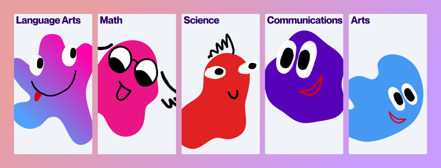
The characters, referred to as “Blobs,” were designed to act as visual anchors throughout the experience.
Each character represents a different area of the curriculum, helping users associate content with recognizable visual elements.
Rather than being purely decorative, these characters function as part of the interface, guiding attention and reinforcing structure. In addition to character mascots that represent an academic subject, I created additional shapes and faces that the AtomicMind team can mix and match for use across the website, marketing materials, and social media as the brand grows.

To support storytelling and onboarding, I also created animated promotional videos using Figma-based motion tools.
These videos introduced the product, explained its value, and brought the character system to life in a way that static pages could not.
QuantumKids allowed AtomicMind to expand into a new segment while maintaining a cohesive brand presence.
It demonstrated that the system could adapt to different audiences without becoming fragmented.
As new products were introduced, inconsistencies began to emerge across AtomicMind’s digital ecosystem.
Different visual styles, component variations, and interaction patterns created a fragmented experience.
The challenge at this stage was to unify these elements into a cohesive system without limiting future flexibility.
I revisited the marketing site with a focus on aligning it with the visual and structural patterns established in Discover+ and QuantumKids.
This involved:
The navigation was also redesigned to better reflect the expanded ecosystem, including a mega menu that organizes services by grade level and a utility bar that connects all sub-brands.
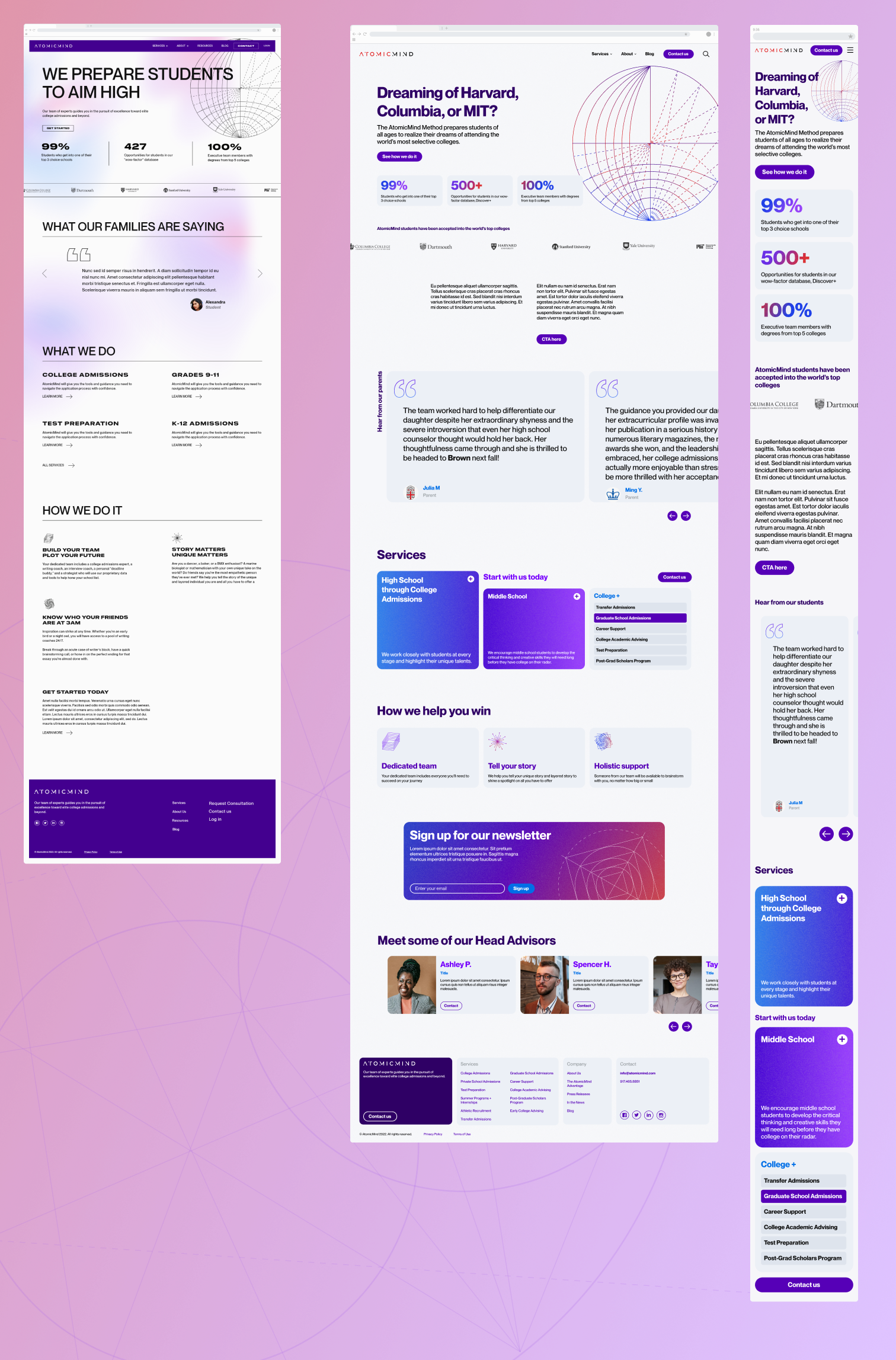
Throughout the project, design decisions were shaped by both stakeholder vision and platform constraints.
AtomicMind’s founders had a strong and clearly defined perspective on how the brand should be positioned, particularly given their audience of high-performing students and international families. In earlier design explorations, I proposed a more expressive visual direction to highlight the personalized nature of the service. However, based on feedback, the direction shifted toward a more minimal, editorial aesthetic that emphasized credibility and sophistication.
This required refining the design approach to rely more heavily on typography, layout, and hierarchy rather than visual embellishment, ensuring the experience aligned with the brand’s positioning.
On the development side, work was implemented across both WordPress and Webflow environments. While there were no major technical blockers, this required designing with system flexibility in mind, including reusable components, responsive layouts, and content structures that could adapt to CMS constraints.
For Discover+, integration with Airtable introduced additional considerations around how structured data would map to UI components, particularly when handling incomplete or inconsistent entries.
These constraints reinforced the importance of aligning design decisions not only with user needs, but also with stakeholder expectations and technical realities.
Following the launch of the redesigned marketing site, AtomicMind saw consistent user engagement and steady growth in traffic over time.
Between January and September 2023:
Scroll behavior analysis revealed important insights into how users engaged with the page structure:
These insights reinforced the importance of structuring content for progressive engagement and informed later iterations of layout and content hierarchy.
Discover+ introduced a new entry point into the AtomicMind ecosystem, shifting the company from a purely service-based model to a platform that supports independent exploration.
By making opportunities searchable and structured, the platform:
QuantumKids enabled AtomicMind to expand into a new audience segment, introducing younger learners to the brand through a more engaging and accessible experience.
The introduction of a character-driven system and simplified visual language:
This created a foundation for long-term user relationships, extending AtomicMind’s presence earlier in the student journey.
This project marked a shift from designing individual pages to designing systems that evolve over time.
As AtomicMind grew, the complexity was not in any single interface, but in maintaining clarity across multiple products, audiences, and use cases.
By focusing on structure, scalability, and cohesion, I helped transform a set of disconnected initiatives into a unified and extensible platform.