Project type
UX/UI design
Web design

Tools
Figma
Webflow

Timeline
6 months
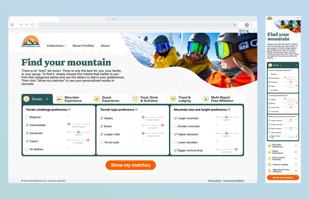
SkiTripPlanner is a web app designed to help groups make complex ski trip decisions by matching them to resorts based on shared and conflicting preferences.
The project was built in collaboration with a domain expert who compiled a structured dataset of ski resorts, including ranking across multiple criteria (e.g. snowfall, sunshine, terrain difficulty, apres-ski, family friendly). My role was to translate this dataset into an experience.
The core challenge was reducing decision friction when multiple users with different skill levels, budgets, and priorities need to agree on a single destination.
I led the design of the preference system, interaction model, and results logic to create a scalable and flexible matching experience.

Planning a ski trip as a group introduces decision friction due to competing preferences across skill level, budget, terrain, and amenities.
Each participant brings different priorities:
Existing solutions rely on static “best of” lists that:
Planning a ski trip as a group introduces decision friction due to competing preferences across skill level, budget, terrain, and amenities.
Group planners (friends, family, trip organizers)
Individual contributors within the group
Due to the nature of the project, we combined:
Key behavioral insights (literature review)
The dataset provided a unique opportunity: instead of requiring users to manually evaluate multiple resorts, we could leverage pre-scored criteria to identify the closest matches to their preferences.
Instead of returning a broad list, the system prioritizes the most relevant results, often narrowing down to a small set of top matches. This shifts the experience from: browsing and comparing to guided decision-making with reduced cognitive load.
User goals:
Core tasks:
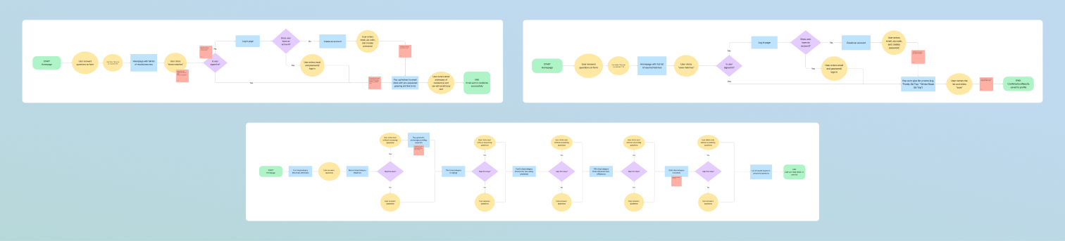
This experience is structured into three layers: preference input (filtering layer), results ranking (decision layer) and resort details (validation layer) to support a natural decision flow.
Each resort in the dataset includes scores across multiple criteria, snow conditions, terrain difficulty, family friendliness, apres-ski experiences, weather, sunshine.
Approach:
I explored three primary interactions models:
Step-by-step flow (typeform style)
This approach provided a clear progression but forced users through all categories, including those that were not relevant to them.

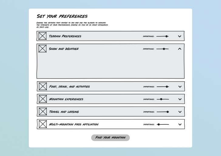
Accordion layout
This allowed flexibility but introduced usability challenges, as users needed to scroll extensively to review or update selections.
Tab-based system (final solution)
This model allowed users to freely navigate between categories, supporting non-linear decision-making by making all inputs easily accessible, and best supports how users approach multi-variable decisions:
This approach reduces cognitive load and aligns with recognition-based interaction patterns.

For the MVP, reducing barriers to entry was a key priority.We chose not to require account creation upfront, allowing users to explore the experience immediately. However, optional account creation was introduced to support saving and sharing resort lists.
This balances:
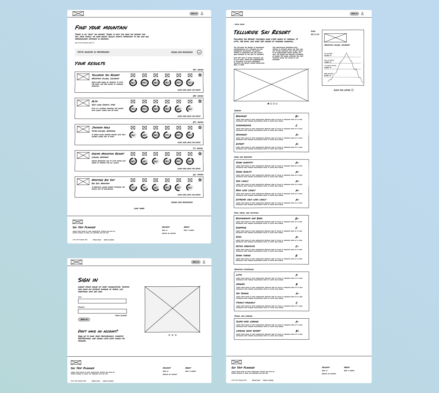
In parallel with the preferences input system, I designed the results and resort detail experiences to support evaluation and decision making. A key challenge was translating multi dimensional data into a format that is easy to scan and compare. Each result card provides a brief description of the resort and includes a match score for each individual category as well as an overall match percentage. The resort profile template includes an image gallery, the scores for each category (based on the dataset), and a scrolling sidebar that displays key stats.
I also created a wireframe for an example results page and a resort profile template. Each result card provides a brief description of the resort and includes a match score for each individual category as well as an overall match percentage. The resort profile template includes an image gallery, the scores for each category (based on data provided by Pete), and a scrolling sidebar that displays key stats.
Once the interaction model and system structure were defined, I focused on translating complex, multi-dimensional data into a visual language that is easy to scan, compare, and trust.
The visual direction was informed by early mood boards aligned with the client’s vision. References that resonated most combined a sense of clarity with a playful, nostalgic tone inspired by vintage ski maps and posters. This informed a visual system that feels approachable without sacrificing readability or structure.
Rather than treating visual design as a styling layer, I used it to reinforce decision-making.
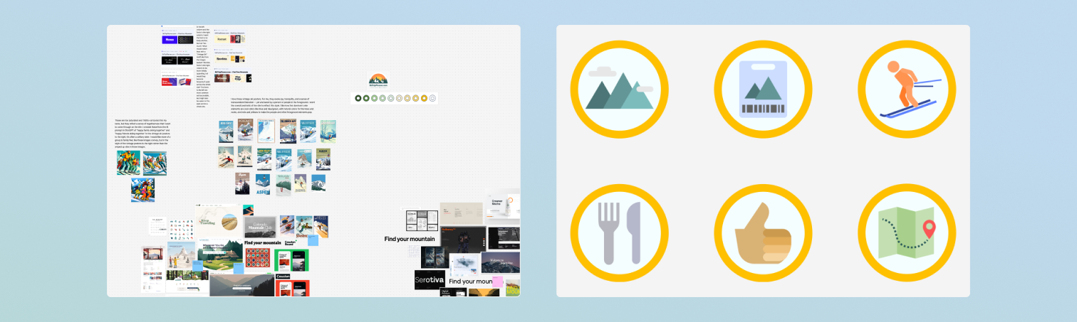
Several key refinements were made during the transition to high-fidelity:
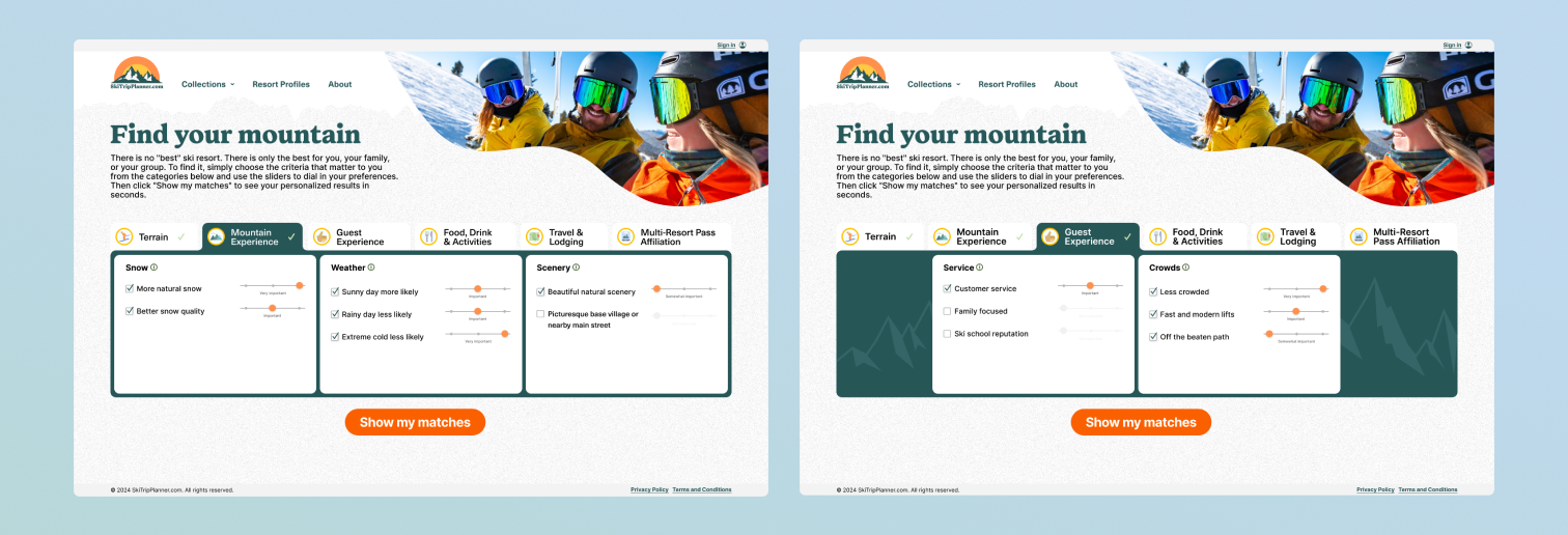
The color system was built from the client’s brand palette, using a bold green for active states and structure, balanced with neutral backgrounds to maintain readability. Subtle texture was introduced through a light noise pattern to add depth without interfering with content hierarchy.

Designing for mobile required rethinking the interaction model to maintain clarity within a constrained space. While the desktop experience uses a tab-based system, the mobile version reintroduces an accordion pattern to ensure all categories remain visible and accessible without horizontal scrolling.
Special attention was given to:
The mobile experience was designed to feel closer to a native app than a responsive website, ensuring usability in real-world, on-the-go scenarios.

The product was built in Webflow in close collaboration with engineering.
During implementation, I worked directly with the developer to identify edge cases in the matching logic and ensure the integrity of the dataset was preserved across all states. This included validating how incomplete inputs, conflicting preferences, and missing data would impact results.
A full QA pass was conducted to:
This phase was critical to maintaining trust in the system, as even small inconsistencies in results could undermine user confidence.
We delivered a fully functional MVP that transforms a traditionally fragmented planning process into a structured, guided decision experience.
The final product enables users to:
By shifting from static browsing to a preference-driven matching system, the experience reduces cognitive load while increasing clarity and trust.
This project highlighted that the core challenge was not visual design alone, but designing for decision-making under complexity.Balancing flexibility with simplicity required careful prioritization of what to show, when to show it, and how to represent it. The final solution demonstrates how thoughtful interaction and visual design can work together to simplify multi-variable decisions without oversimplifying the problem itself.